Don’t Eat the Burger. It’s a Stool.
17 January 2025 at 05:00
Furniture resembling food — fruit, sandwiches and more — has gone viral on social media and led to a shopping frenzy.
The modern web has gradually shifted from a vibrant tapestry of personal expression to a landscape of identical designs, where millions of websites share not just similar structures, but identical visual language, spacing, and interaction patterns. As we collectively gravitate toward the same “proven” layouts and “conversion-optimized” designs, we’re not just losing visual diversity – we’re ceding control over how we present ourselves to the world. This matters because genuine self-expression online isn’t just about aesthetics – it’s about maintaining spaces where authentic voices can flourish.
When every blog has the same hero section, when every portfolio follows the same grid, when every restaurant site looks interchangeable, we create an echo chamber of sameness. The cost isn’t just visual monotony – it’s the slow erosion of the web’s ability to surprise, delight, and showcase truly individual perspectives. WordPress, with its emphasis on complete ownership and control, offers an opportunity to break free from this convergence of design, allowing creators to build digital spaces that truly reflect their unique voice and vision.
Think of WordPress themes like album covers. They should have personality and create an immediate visual impact. The web has become too sanitized, with everyone chasing the same minimal, “professional” look.
Great themes should:
We need more themes that make people say “Wow!” or “That’s different!” rather than “That’s clean and professional.” The web needs more personality, more risk-taking, more fun.
After spending countless hours digging through the WordPress theme repository, searching for designs that break the mold and spark excitement, I came up nearly empty-handed. Don’t get me wrong – there are plenty of well-built themes out there. But where’s the daring? The personality? The unexpected?
If you’ve got a wild theme idea burning in your mind – that portfolio theme that looks like a vintage trading card collection, that blog theme inspired by zine culture, that restaurant theme that feels like a hand-drawn menu – now’s the time to build it. WordPress desperately needs your creativity, your weird ideas, your willingness to break the visual rules. The future of the web shouldn’t be a monochrome landscape of identical layouts. Let’s make WordPress themes exciting again. Let’s make the web weird again.
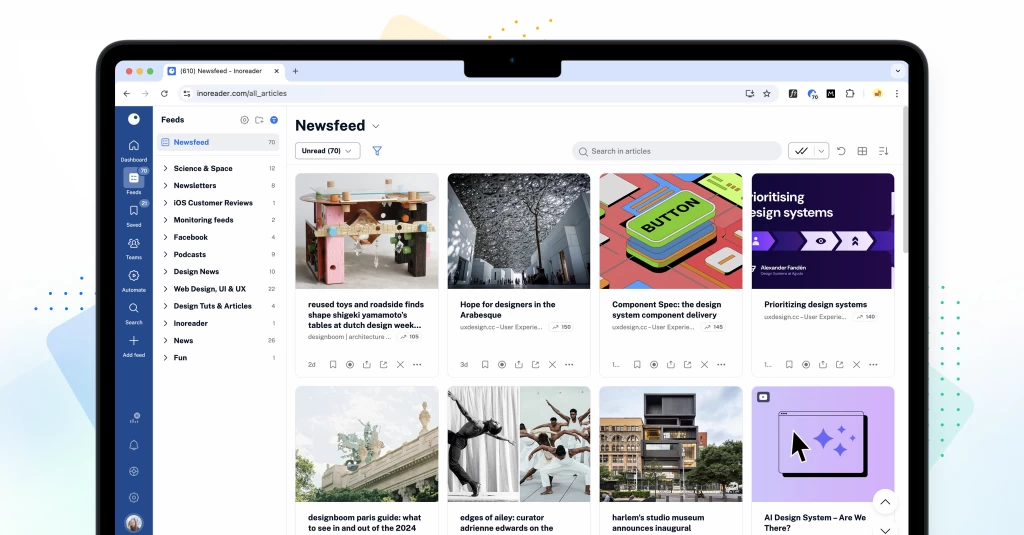
After months of hard work, testing, breaking, fixing, and rebuilding, the cat is finally out of the bag. The brand-new Inoreader is here, and we couldn’t be more excited to share it with you! Our latest major update marks a significant milestone for our team, and we’ve done our best to bring you a fresh and modern interface with new and updated features to enhance your experience.
It’s been a while since our last major update, and we recognize that during this time, both the digital landscape and our users’ needs have evolved. Over the past few years, we’ve rolled out many new features that we felt needed to be organized and integrated into a cohesive experience. As we’ve grown alongside our community, we’ve listened to your feedback and observed how you interact with our platform. Our goal has always been to make content discovery, consumption, and distribution seamless and enjoyable.
With this redesign, we’ve reimagined Inoreader’s UI to provide intuitive and user-friendly solutions at every step. We’ve modernized our interface, making it sleeker and more visually appealing while ensuring it remains easy to navigate. We’ve put considerable effort into preserving the familiarity and usability of features from the previous design so you can feel right at home in this new environment. Whether you’re a long-time power user or new to Inoreader, we believe these changes will significantly improve your workflows and make managing your content a breeze. Read on to learn what’s in store with this major release!
The first thing you’ll probably notice is Inoreader’s sleek new look. All themes have been updated with refreshed brand colors, offering a more visually appealing and cohesive experience. Enhanced components, including dialogues, menus, and other elements, provide a more intuitive and user-friendly interface. We’ve also dedicated significant effort to developing a responsive mobile experience, allowing you to transition your entire workflow to your phone without sacrificing functionality.
Navigating Inoreader has become easier than ever with the new tab bar and dynamic sidebar. These features provide quick and easy access to all key sections of your account, including dashboards, feeds, saved items, Team spaces, automations, and dedicated tabs for searching articles and adding feeds. The intuitive layout helps you find what you need at a glance, ensuring you can effortlessly switch between sections while saving valuable time and effort.
Our redesigned dashboards offer improved customization with various new and updated widgets. Choose a layout to showcase essential content at a glance, creating a personalized space that meets your preferences. Key updates include new onboarding widgets to assist users during account setup, content widgets to highlight the most relevant articles, and data widgets to track your reading habits and feed performance, enabling effective usage monitoring.
The new Saved section redefines how you organize your personal library in Inoreader. It’s the central hub for articles saved to read later, archived items, annotations, and tags – all in one place. Enjoy a new article view featuring estimated reading times, progress tracking, and editable metadata for easier content management. The Continue reading tab lets you pick up right where you left off. To keep your reading list clutter-free, move articles you’ve read but would like to keep to the new Archive. With the ability to cross-select tags, discovering relevant content is just a few clicks away. Additionally, saving articles and external pages from the web is extremely easy, either through the Add web page button inside Inoreader or via the browser extension, available for the web and all apps.
The recent updates to content filters are designed to save you time and effort by enabling you to apply filters to entire folders. This enhancement simplifies content management while reducing filter limitations. Additionally, you can now view items removed by your filters through the new Filters dashboard in the Automate section. Simply click on the number displayed under Removed today to access a log of all removed articles, giving you greater visibility and control.
Finding the content you need is now more efficient with our enhanced search functionality. The new contextual search allows you to seamlessly search within feeds, folders, and other sections of your account. Additionally, the dedicated article-only search engine in the tab bar simplifies finding specific content, whether from publicly available sources or within your own account.
Our background audio player also has a sleek new design. You can now access it directly from your tab bar and enjoy listening to articles and podcasts while browsing or multitasking. Easily add items to your queue from any feed, folder, or article, and rearrange your playlist on the go for a seamless listening experience.
We have made some significant improvements to how you interact with YouTube content on Inoreader. You can now filter out videos under 60 seconds, with Shorts easily identifiable by a distinct icon in your feeds. Additionally, you can view video durations and identify live videos, whether scheduled or ongoing, at a glance. These updates give you more control and a clearer overview of your YouTube content.
The Teams section of Inoreader has undergone a complete redesign, now featuring separate tabs for essential areas such as Activity, Members, Digests, Folders, Channels, Tags, Organization, and Billing. These updates are further enhanced by new features like shared annotations to facilitate collaboration and email digest logs for easy access to past issues with detailed metadata.
In addition to these major updates, we’ve made some smaller changes to enhance your overall experience:
We hope these updates ensure a smooth and personalized workflow for your needs.
To conclude this lengthy post on a warm note, we want to express our sincere gratitude to our users for your continued support, patience, and feedback throughout the redesign process. Your insights, ideas, and suggestions have played a crucial role in shaping the new Inoreader experience, and we truly hope you enjoy the enhancements we’ve made. As we move forward, we’ll be listening closely to your feedback and addressing any minor bugs that may arise in the coming weeks. If you have any thoughts or reports to share, please reach out through the feedback form in your Inoreader account. Thank you for being a part of our community!
The post The new Inoreader experience is here! 🎉 appeared first on Inoreader blog.