Normal view

There are new articles available, click to refresh the page.
Before yesterdayMain stream

Top Data Integration Strategies for Business Intelligence (BI)

12 August 2022 at 12:35

Today’s technology can enable businesses and organizations to harness their data to its fullest potential and gain insights to help boost performance and success. That is, if they use all of their data.

It is possible to source data from many different tools and systems involved in a business’s processes. Therefore, being unable to develop insights from data sources could mean missing out on some vital information. Specifically, information that could otherwise propel a business to success.

You never know what data could be monumental in transforming business practices for the better, which is why it is so important to be able to access and analyze as much as possible. In order to do this, data integration strategies can facilitate the transfer and use of data between locations.

How does integrated data impact BI of a company?

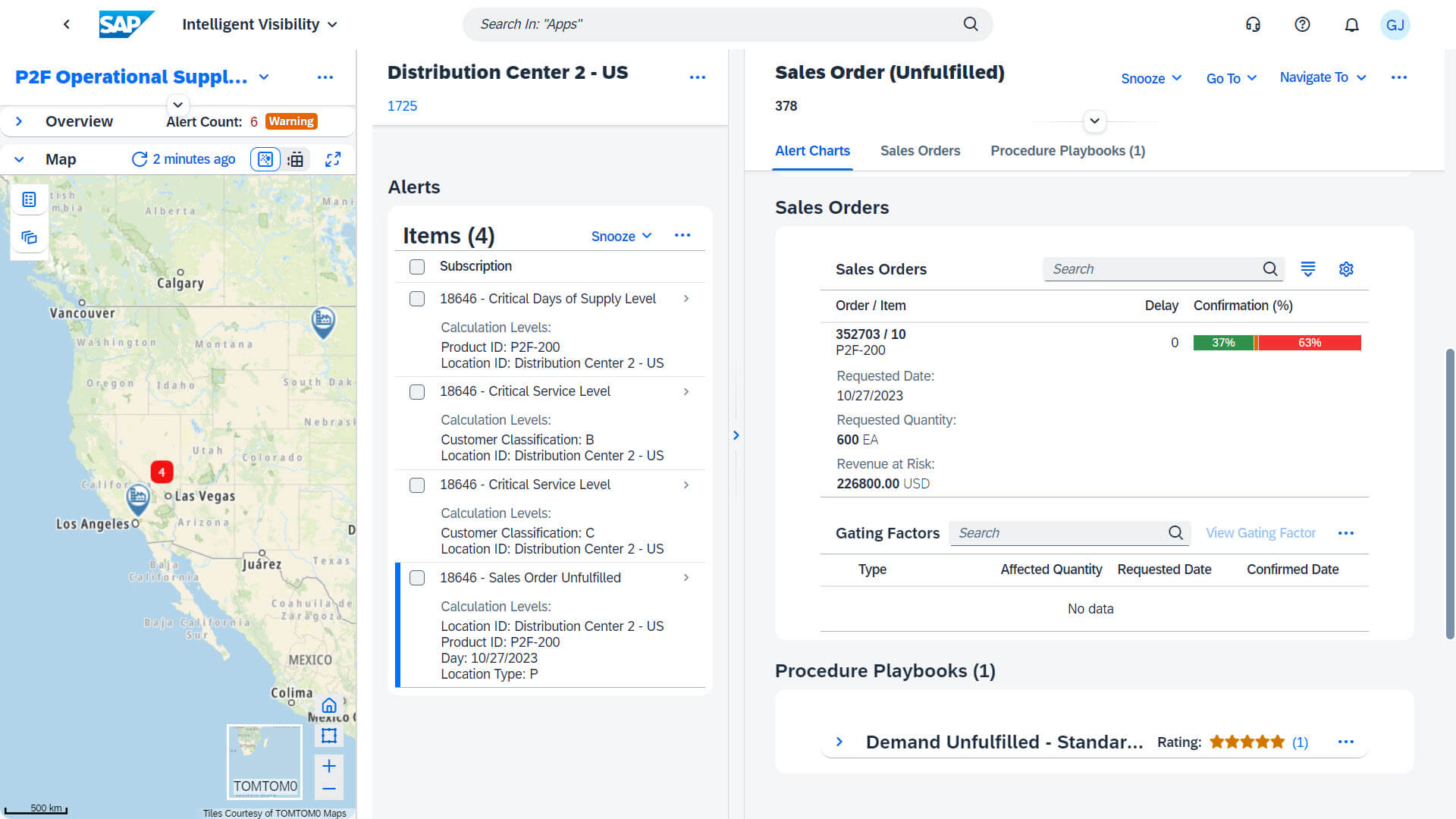
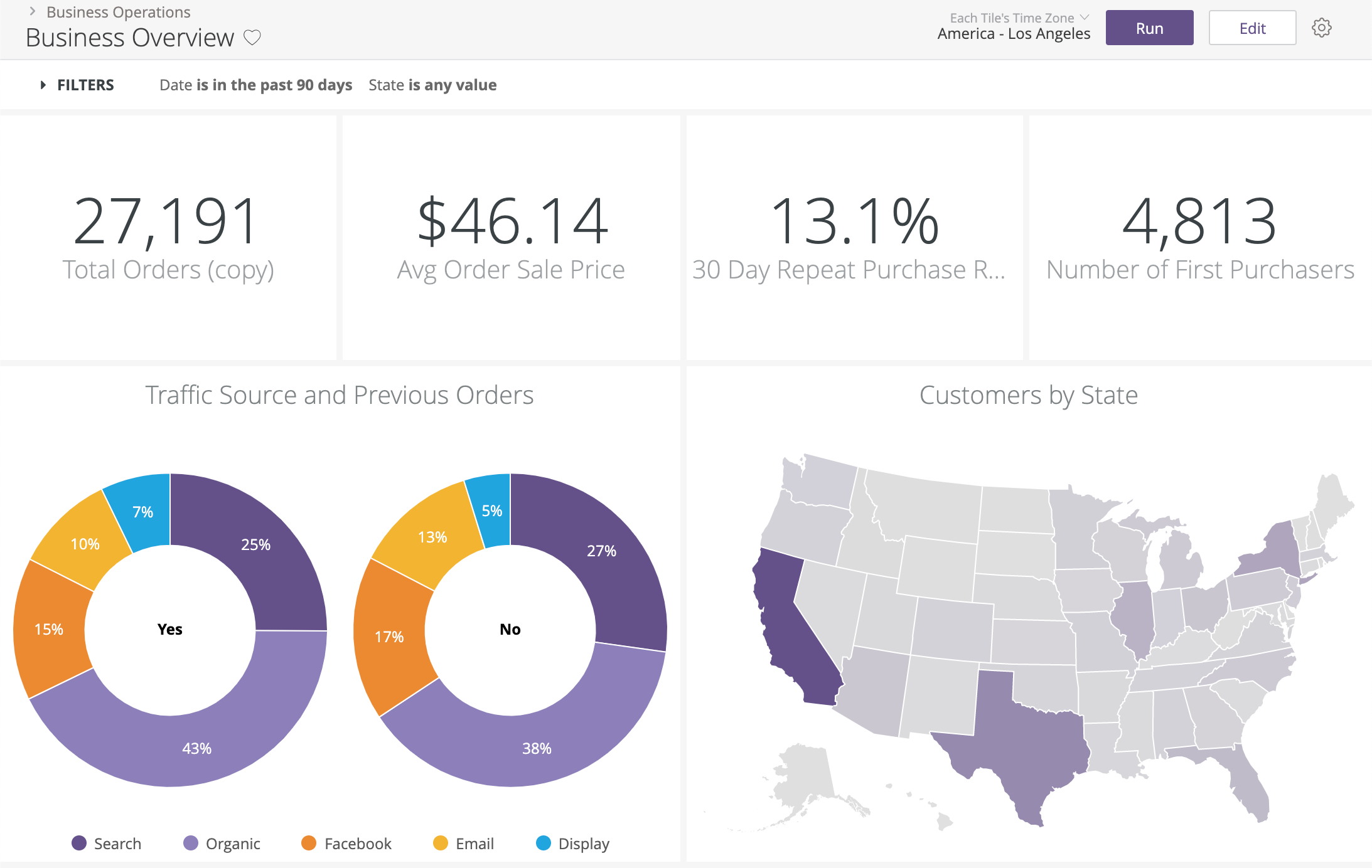
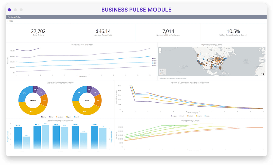
Integrated data can support BI for companies, as it can enable them to gain insights to help them make actionable decisions. These insights inform organizations of the best possible methods for achieving their desired results and help them determine ways to adjust their business strategies to incorporate this knowledge.

What outcomes are possible with data integration?

Businesses that integrate their data can find ways to improve their business decisions and processes to generate beneficial outcomes.

For example, suppose a business was to integrate its data to enable it to use the data for analysis within a software system. This could help the business determine insights and develop methods to improve its return on investment, promote its services and products, and predict future business scenarios.

Data integration can also help to improve communication and collaboration among decision-makers. This could enable them to determine methods for reaching better business outcomes.

What important data integration speedbumps might impact your BI?

Of course, the value of an insight brought on by data analysis depends on the accuracy of the data being analyzed. Unfortunately, speed bumps can pop up throughout the data integration process, which could compromise the value and usefulness of the integrated data.

Data silos

Data silos are usually accessible by a select group of individuals and can create issues with data sharing and integration. In addition, the inaccessibility and limited visibility mean that it can often be misunderstood or result in poor data quality. This can also cause inconsistencies in data that may overlap across other locations, threatening data integrity.

Data inconsistency

Data inconsistency refers is when different versions of identical data exist in multiple places. This can end up creating an incorrect representation of the information within a database. This can cause significant issues with analyzing data. Some forms of data inconsistency can include temporal, semantic, structural, and transformation inconsistency.

Disorganized data

Disorganized data, or unstructured data, is data that does not follow any predefined structure or organization hierarchy. Disorganized data can be problematic when integrating data from various sources for use within a separate system.

Compromised data integrity 

Many of the aforementioned issues can result in compromised data integrity. This means the data is no longer accurate or consistent. Compromised data serves no value to BI, as it cannot be analyzed to gain real insights about the business.

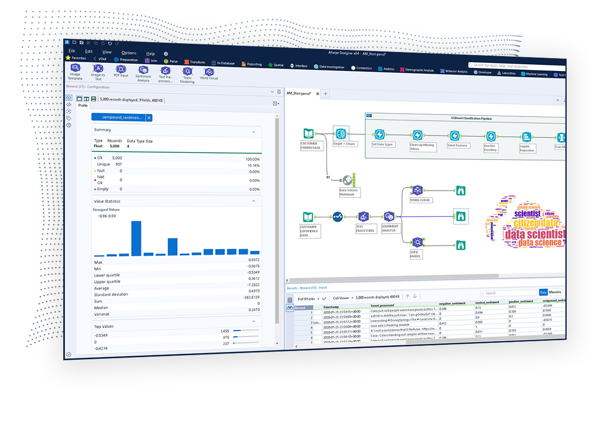
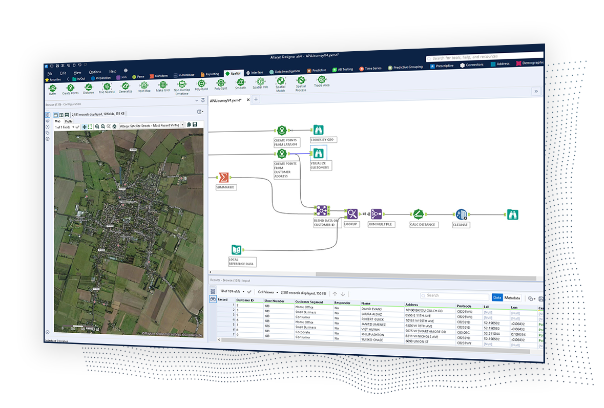
Strategies for Integrating Data Into BI

Application-based integration

Many enterprise applications use prebuilt connections to facilitate the transfer of information from the source into the desired location. These applications can usually automate the retrieval, transformation, and movement of this data information, making it an easy integration option.

While this may be an ideal method for data integration, built-in connections are not always supported between software systems. Therefore, using another data integration method in these cases may be helpful.

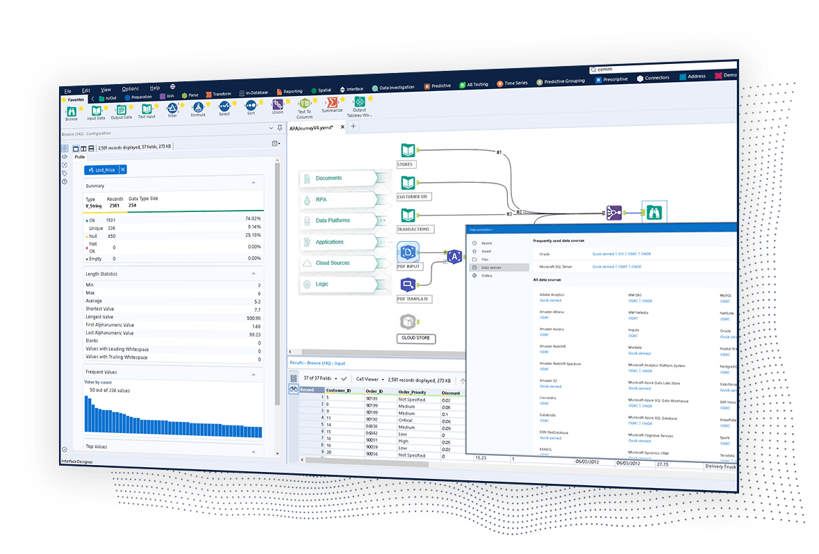
Middleware data integration

Middleware enables the sharing of data between multiple applications. Businesses can use middleware to transfer data from source systems. This can then be moved into a central data repository, where it can be accessed for data analysis.

A helpful aspect of middleware data integration is that middleware platforms can validate and format the data before transferring it. This ensures businesses won’t end up with compromised data integrity or disorganized data.

Common storage (data warehousing)

Common storage integration is when data is copied from the source location and then transferred to a data warehouse. The data warehouse will store the information and display it in a consistent format.

The data is transformed prior to copying and storage. This means all of the information in the data warehouse has a consistent, uniformed appearance. This integration method is also great for data integrity, as all data information is accessible from the data warehouse as one single source.

Data consolidation

Data consolidation is when information from multiple data sources are combined within a system, which acts as a new single source of truth for the organization. The data consolidation technique can enable organizations to maintain fewer storage locations for data.

ETL (extract, transform, load) technology is an example of a system that uses data consolidation to move large amounts of data. It does so by pulling data from sources, cleaning, filtering, transforming, and applying business rules to the data before finally transferring it to the end location.

Hand-coding (manual data integration)

Hand-coding is the manual data integration process where humans will evaluate and categorize data without using a software system. This way, the business can develop its own strategies and custom code for organizing and integrating data information.

While this method may provide more control over the integration process, it has several drawbacks. Hand-coding can be a slow and tedious job, and the lack of automation also means a greater likelihood of human error throughout the process. Manually integrating data also means needing to manually change code when integrating new data, which can make it challenging to scale and maintain the information for larger datasets.

The post Top Data Integration Strategies for Business Intelligence (BI) appeared first on TechnologyAdvice.

Looker vs. Tableau: An In-Depth Data Analysis Showdown 2024

By: Don Hall
10 April 2024 at 10:00

Key takeaways

  • Tableau specializes in creating visualization dashboards and has pre-made templates. It’s cost is based on a per-user license and is ideal for smaller businesses.
  • Looker is a browser-based intelligence software that can also operate on mobile. Looker’s cost is on a per-month basis and while it is more expensive than Tableau, it offers more extensive features.

When comparing Looker vs. Tableau, two of the most popular business intelligence (BI) software tools on the market today, it’s crucial to have the facts laid out as clearly as possible before making a decision.

Business intelligence software executes data preparation and management, data querying, predictive analytics, and many other analytical tools that help managers make better decisions based on BI outputs. We will look at the features of each BI software tool to give readers more insight into which product will best fit their companies.

TechnologyAdvice is able to offer our services for free because some vendors may pay us for web traffic or other sales opportunities. Our mission is to help technology buyers make better purchasing decisions, so we provide you with information for all vendors — even those that don’t pay us.

Featured partners

Google Looker logo.

Looker

Overall Score

4.16/5

Pricing

3.13/5

General Features & Interface

3.75/5

Core Features

5/5

Advanced Features

4/5

Integration & Compatibility

5/5

UX

3.75/5

Pros

  • Powerful data modeling
  • Scalable to handle large datasets
  • Highly customizable
  • Free tier

Cons

  • Cost
  • Mixes reviews on customer supper
  • Limited data security due to cloud hosting

Looker is a cloud-based Business Intelligence (BI) platform purchased by Google in 2019. Designed to offer insights and analytics, its strength lies in the powerful data modeling layer. This layer emphasizes a “single source of truth” model, ensuring accurate metric readings by consolidating information from various sources onto one dashboard.

Looker’s data modeling allows users to define intricate information and create reusable models. These can be used throughout the platform, ensuring data consistency and accuracy. This approach streamlines data exploration, giving users confidence in the displayed data.

The 23.4 release introduced the Looker Studio Connector and Connected Sheets for all Looker-hosted instances. This enhancement allows users to access and analyze Looker-modeled data, expanding the platform’s capabilities. Another feature, the Performant Field Picker Labs, offers refined search options for large Explore field pickers.

Data Exploration and Discovery: Looker allows users to explore and discover data in real-time using an intuitive interface that requires no SQL knowledge.

Customizable Dashboards: Users can create and share interactive, customizable dashboards that offer a comprehensive view of business metrics.

Integrated Workflow: Looker integrates seamlessly with other tools, enabling users to embed insights directly into business workflows and applications.

Data Modeling Layer: The LookML modeling layer enables users to define business logic centrally, ensuring consistency across all analytics.

Collaborative Data Analytics: Looker supports collaboration by allowing users to share data insights with team members through links, dashboards, or scheduled reports.

Real-Time Data Insights: Looker provides real-time insights, enabling businesses to act on the most current data available.

Embedded Analytics: Organizations can embed Looker’s analytics capabilities into their own applications to offer data-driven experiences.

Robust Security and Compliance: Looker offers enterprise-grade security features and compliance certifications, ensuring that data remains safe and secure.

Looker business intelligence Dashboard view.
Looker dashboard.
Looker business intelligence Dashboard view.
Tableau logo.

Tableau

Overall Score

4.34/5

Pricing

3.13/5

General Features & Interface

3.75/5

Core Features

5/5

Advanced Features

4/5

Integration & Compatibility

5/5

UX

3.75/5

Pros

  • User-friendly interface
  • Excellent data visualization capabilities
  • Ability to blend data from multiple sources

Cons

  • Slow performance when working with large datasets
  • Additional software required for advanced data cleaning

Tableau is a data visualization and business intelligence (BI) tool designed to help users interpret and understand their data.

Through its interface, users can create visual representations like dashboards, reports, and charts from raw data. The software allows for data integration from various sources, from databases to cloud services. Over time, Tableau has been adopted by many due to its straightforward features and ability to handle complex data sets. With each release, including the 2023.1 update, Tableau introduces modifications and improvements, reflecting feedback and the changing landscape of data analysis.

  • Data Visualization: Tableau excels in creating powerful, interactive visualizations that help users understand complex data intuitively.
  • Drag-and-Drop Interface: The drag-and-drop interface allows users to easily create visualizations and dashboards without the need for advanced technical skills.
  • Data Blending: Tableau enables users to combine data from multiple sources into a single view, providing a holistic perspective.
  • Real-Time Data Analysis: Users can connect to live data sources and perform real-time analysis to make timely decisions.
  • Dashboard Sharing and Collaboration: Tableau allows users to share dashboards and collaborate with others, enhancing teamwork and decision-making.
  • Mobile-Friendly Dashboards: Dashboards in Tableau are optimized for mobile devices, ensuring accessibility and usability on the go.
  • Advanced Analytics and Calculations: Tableau offers built-in tools for performing advanced analytics, such as trend analysis, forecasting, and statistical modeling.
  • Integration with Other Tools: Tableau integrates with a wide range of data sources and tools, including cloud services, databases, and spreadsheets, making it versatile and adaptable.

Looker vs. Tableau: A detailed comparison

Business intelligence software has many tools to provide insightful details managers can use. However, to get the most out of one of these tools, managers need to know the company size, the types of charts and graphs needed, and the business analytical requirements.

With that data in hand, one can use this comparison as a tool to help make your final decision the right decision. 

Looker vs. Tableau: Commonalities

Looker and Tableau are both comprehensive, flexible, and scalable solutions that prioritize user accessibility and collaboration. While they each have their unique strengths and weaknesses, these core commonalities make them leading choices in the realm of business intelligence software:

Looker and Tableau both offer an array of BI tools to help businesses make informed decisions using advanced Machine Learning (ML) concepts.

Both platforms are incredibly user-friendly.

You don’t need to be a data scientist to navigate through them; they’re built for everyone from the intern in the marketing department to the CFO. This universal appeal is what makes them so indispensable.

It’s like having a universal remote for all your data sources.

Integration is another area where both stand out. Whether your data lives in the cloud, in SQL databases, or even in good old Excel sheets, Looker and Tableau make it a easy to pull that data in.

Let’s talk about scalability.

Looker and Tableau have engineered their platforms to be highly scalable so they grow alongside your business.

Tableau offers a distributed server architecture that allows you to add more server nodes as your data and user base expand. This means you can handle larger data sets and more concurrent users without sacrificing performance.

Looker leverages an in-database architecture, allowing it to push queries to the database itself. This ensures that as your data grows, you can scale your database resources to maintain high-speed analytics. Both platforms also offer cloud-based solutions, providing the elasticity to quickly scale up or down based on your needs.

Both tools are big on teamwork.

They offer nifty collaboration features that make it easy to share insights, annotate findings, and even distribute reports. It’s like a virtual huddle for your team, where everyone gets to contribute to the game plan.

Also read: Tableau Alternatives

Looker vs. Tableau: Key differences

Looker is fully deployed as a browser-based intelligence software with no desktop installation requirement. In addition, Looker offers a mobile app solution. Tableau is a desktop-based platform with a Tableau license for cloud access but with limited cloud capabilities. Looker uses its version of structured query language called LookML with pre-built Looker Blocks. Tableau uses a spatial file connector to create maps.

While those are substantial differences, when it comes to team-facing features, the two titles serve the same overall purpose.

What are the key features of Looker?

Looker business intelligence dashboard presenting data and analytics.
Looker dashboard.

Looker offers several key features that will enhance the ability to view data in real-time, build applications with embedded analytics, and provide proactive insights with instant alerting for quicker decision-making. Here are some of the key features of Looker:

SQL-based type language used for data modeling and complex data analysis.

Used to create unique applications or modify existing applications with embedded analytics.

Allows users to develop reports in ad-hoc or governed data environments, which allows for data analysis in ad-hoc and governed data environments.

Looker API is used for calling data while providing a secure RESTful API that allows users to create custom applications, workflows, and scripts that can automate tasks.

Looker is owned by Google and is built on their cloud infrastructure that is available as a service to allow users to manage their Looker instances.

Predefined and pre-built code that expedites the development of applications, workflows, and analytics.

A development platform that helps developers build Looker applications while automatically performing some of the necessary steps to save time.

Looker has a mobile solution for any Internet-connected mobile device that users can access using a QR code or biometric authentication.

Provides expected authentication and access controls that help businesses stay within compliance regulations.

Interface code that helps developers create filter controls like radio buttons, sliders, and tag lists, which can be embedded in applications or dashboards.

What are the key features of Tableau?

Tableau business intelligence dashboards shown on desktop, tablet, and mobile.

Tableau’s focus is on creating sophisticated visual representations of data. As a result, Tableau allows users to quickly analyze large amounts of data that can be converted into reports. Tableau has a heavy focus on dashboards, but here are some other key features of this BI solution:

Offers a wide variety of visual objects and text elements that can form stories or provide multiple views, layouts, and formats using the available filters.

Provides instant data sharing for quick reviews of dashboards and data visualization.

The ability to connect to live data sources or extract data from external sources allowing a user to access data from multiple sources without limitations.

A primary feature that allows users to create a wide variety of data visualizations.

Pre-installed map information on cities, and the maps can contain geology layers.

Tableau has a foolproof security system that uses authentication and a permission methodology for user access and data connections.

The ability to create views to be seen on iOS and Android devices.

Allows users to type a query about data using their natural language and the ability of this feature to respond with text or a visual representation as an answer.

Uses time series forecasting by selecting historical time-stamped data

Looker vs. Tableau: Pricing

Looker pricing:

  • Platform pricing: Looker offers three editions—Standard, Enterprise, and Embed. The Standard edition costs $5,000 per month with a pay-as-you-go model. Enterprise and Embed editions require you to call sales for an annual commitment.
  • User licensing: Looker offers three types of user licenses—Viewer ($30/user/month), Standard ($60/user/month), and Developer ($125/user/month). These fees are consistent across all editions.

Tableau pricing:

  • License tiers: Tableau offers three tiers—Creator, Explorer, and Viewer. The Creator license is $70/user/month for the cloud version and $35/user/month for on-premise. The Explorer license is $42/user/month for cloud and $20/user/month for on-premise. The Viewer license is $15/user/month for cloud and $10/user/month for on-premise.
  • Enterprise package: Tableau also offers an enterprise package with custom pricing.
  • Additional Costs: Some users have noted that Tableau may require additional tools for data extraction, adding to the total cost.

Key takeaways

  • Looker offers a more customized pricing model, allowing for tailored solutions. Tableau offers fixed pricing tiers, which may or may not suit all organizational needs.
  • Both platforms offer tiered user licensing but differ in costs and capabilities.
  • Tableau provides upfront pricing, whereas Looker requires you to engage with their sales team for most of their offerings.

Looker vs. Tableau: Feature comparison overview

As you can see, Looker and Tableau have different key features available to users. This section will look at some of the expected features of a business intelligence and data analytics software solution.

FeatureLookerTableauAdvantage
Data VisualizationLooker provides a dynamic dashboard filter feature that can filter for data visualization types and specific users or groups. Looker also has a mapping feature to aid in chart creation.Tableau specializes in visualization dashboards and infographics. Tableau provides pre-made templates and has a wizard feature that helps non-technical users.Tableau business analytics logo.
IntegrationLooker integrates with big data platforms and databases and can execute queries without extracting dataTableau has over 200 connectors that can connect to multiple sources such as RDBMS, spreadsheets, Presto, SQL Server, Cloudera, Hadoop, Amazon Athena, and SalesforceTableau business analytics logo.Looker Logo
Data ModelingLookML is a data modeling tool that is reusable and flexible. LookML has pre-built modeling called Looker Blocks used to build sophisticated query analytics  Tableau uses snowflakes and dimensional data models that help improve the performance of queriesLooker Logo
ReportingProvides basic reporting templatesUsers can build customized reports with extensive connectors to create dashboards and reportsTableau business analytics logo.
SpeedLooker is slower, and users may need several hours to share a reportAllows a user to create visualization reports in short periodsTableau business analytics logo.
Advanced AnalyticsLooker pre-built code blocks are configurable, and LookLM allows for a deeper analytical review of dataTableau does not have pre-built code blocks, but it is more configurable than LookerLooker Logo
SecurityLooker provides an admin panel to change security settings and 2-factor authenticationTableau allows a user to protect reports and dashboards, but not with the detail of LookerLooker Logo
Mobile SupportLooker’s mobile app allows you to view data using any browser with an Internet connection. Emails and chat sessions are available too. Users can log in using a QR code or biometricsAndroid and iOS devices can use Tableau’s mobile web applicationLooker Logo
PricingFor a company, $5,000/per month, but Looker offers a variety of business plans depending on sizeTableau’s creator license cost per user is $70/per month, and for a viewer, it’s $15/per monthTableau business analytics logo.

Looker vs. Tableau: Which BI software is right for your business

The best BI solution is subjective since every company’s situation differs slightly. For example, a company that uses Salesforce may lean towards Tableau since Salesforce purchased Tableau four years ago. Any company heavily invested in using Google products may lean towards Looker. Just because a company uses Google or Salesforce products should not be the basis for a decision.

Other factors to consider are the existing infrastructure, analytical data needs, and storage preferences, whether cloud or local, are only a subset of reasons why a company may choose one BI product over the other.

How to choose between Tableau vs Looker

A business need for a BI software solution was identified as a requirement. Next, the company generates a list of requirements on why BI software is needed. These requirements vary from company to company, but they are the driving force behind choosing a BI solution. Finally, decision-makers are on track to make the right decision using the key features and the comparison overview along with additional research.

Looking for the latest in Business Intelligence solutions? Check out our Business Intelligence Software Buyer’s Guide.

Frequently Asked Questions (FAQ)

When comparing Looker vs Tableau, know both are powerful BI tools, but they serve different needs. Looker excels in data modeling and integration with SQL-based databases, while Tableau is known for its advanced visualizations and ease of use. The choice depends on your specific requirements.

The downside of Looker is its reliance on SQL for data exploration, which can be a barrier for non-technical users. Additionally, its pricing can be prohibitive for smaller businesses, and it may require more setup and customization compared to other BI tools.

Looker is expensive due to its robust data modeling capabilities, enterprise-level features, and deep integration with SQL databases. The cost reflects the advanced functionality, scalability, and customization options it offers to large organizations.

Yes, Looker is owned by Google. It was acquired by Google in 2020 and is now part of the Google Cloud ecosystem, enhancing its integration with other Google Cloud services.

Tableau is better for users seeking intuitive, visually rich analytics with minimal setup, while Looker is preferred for those needing strong data modeling and SQL-based querying. The best choice depends on your business needs and technical expertise.

Tableau uses a distributed server architecture to manage increased data and user loads, whereas Looker relies on in-database processing to scale alongside your database resources.

The post Looker vs. Tableau: An In-Depth Data Analysis Showdown 2024 appeared first on TechnologyAdvice.

Top Prescriptive Analytics Tools & Software (2024)

29 May 2024 at 13:40

Unlike descriptive and predictive analytics, which focus on understanding past data and predicting future trends, prescriptive analytics provides actionable recommendations on what steps to take next. Below are nine of the best prescriptive analytics tools to help you forecast the business weather and prepare for the storms ahead.

TechnologyAdvice is able to offer our services for free because some vendors may pay us for web traffic or other sales opportunities. Our mission is to help technology buyers make better purchasing decisions, so we provide you with information for all vendors — even those that don’t pay us.

Featured partners

Product

Score

Best For

Key Differentiator

Pricing

Free Trial/Free Plan

Alteryx logo.

Alteryx

4.46

Best end-user experience

User-friendly interface with drag-and-drop functionality

Starts at $4,950/year

Yes/No

Azure logo.

Azure Machine Learning

4.40

Best data privacy

Advanced security features and integration with Azure services

Pay-as-you-go pricing

Yes/No

SAP logo.

SAP Integrated Business Planning

4.32

Best for supply chain optimization

Real-time supply chain analytics and planning

Subscription-based pricing

Yes/No

Google Looker logo.

Looker

4.30

Best for data modeling

Strong data modeling capabilities and integration with Google Cloud

Custom pricing

Yes/No

Tableau logo.

Tableau

4.23

Best for data visualization

Industry-leading data visualization tools

Starts at $75/user/month

Yes/No

Oracle logo.

Oracle Autonomous Data Warehouse

4.18

Best for scalable data management

Elastic scaling and built-in machine learning capabilities

Based on Oracle Cloud services

Yes/No

Altair logo.

RapidMiner Studio

4.18

Best data mining and aggregation

Comprehensive data mining and machine learning tools

Starts at $2,500/year

Yes/Yes

IBM logo.

IBM Decision Optimization

4.15

Best machine learning

Powerful optimization solvers and integration with Watson Studio

Starts at $199/user/month

Yes/No

4.11

Best data science flexibility on a budget

Open-source platform with extensive data integration capabilities

Free for basic version

Yes/Yes

Alteryx logo.

Alteryx: Best for end-user experience

Overall Score

4.46/5

Pricing

2.7/5

General features and interface

4.7/5

Core features

4.8/5

Advanced features

5/5

Integration and compatibility

5/5

UX

4.3/5

Pros

  • Intuitive workflow
  • Data blending capabilities
  • Advanced analytics
  • Data visualization

Cons

  • Complex for beginners
  • Limited collaboration features
  • Cost

Why we chose Alteryx

Alteryx’s simple interface helps break down complex data workflows, making data analysis accessible even to non-coders. This feature, coupled with a comprehensive suite of pre-built analytic models and an extensive library of connectors, allows you to derive actionable insights seamlessly. Its Alteryx Academy further enhances its usability and facilitates speedy adoption. The availability of Alteryx Community, a platform for peer support and learning, underlines why it is our top choice for the best end-user experience.

KNIME, another strong contender known for its flexibility and budget-friendly options, still falls short in user experience compared to Alteryx. While KNIME offers powerful data analytics capabilities, its interface can be less intuitive, requiring more technical knowledge to navigate. Alteryx, on the other hand, prioritizes maintaining a user-friendly design, making it easier for users at all technical levels to perform complex analytics tasks without extensive training. 

Alteryx is your go-to platform for simplifying complex data workflows. Its intuitive drag-and-drop interface makes tasks like data blending, cleansing, and analysis accessible to both technical and non-technical users. 

For small businesses up to large enterprises, Alteryx empowers your analysts with advanced analytics capabilities without requiring extensive coding knowledge. You can take advantage of a wide range of data sources and benefit from extensive training resources through Alteryx Academy. For automating repetitive tasks and boosting your data analysis capabilities, Alteryx offers a powerful and user-friendly solution.

Self-service data analytics: Quick and precise insights delivery with an end-to-end platform for data discovery, blending, and analysis.

Drag-and-drop workflow: Easy creation and alteration of analytical workflows through an intuitive user interface.

Predictive analytics: With more than 60 pre-built tools, Alteryx allows the harnessing of advanced analytics for spatial and statistical analysis and predictive modeling without any coding required.

Data connectors: Native data connectors to numerous sources such as SQL, Oracle, Excel, and Access and supports cloud-based data from AWS, Google Analytics, Salesforce, etc.

Alteryxreviews

Free trial available

Designer Cloud: Starting at $4,950/user/year

Designer Desktop: $5,195/user/year

Azure logo.

Azure Machine Learning: Best for data privacy

Overall Score

4.40/5

Pricing

2.5/5

General features and interface

4.5/5

Core features

5/5

Advanced features

5/5

Integration and compatibility

5/5

UX

4.5/5

Pros

  • Top-notch security
  • Built-in privacy features
  • Enterprise-level control

Cons

  • Dependency on Microsoft ecosystem
  • Limitations in free tier

Why we chose Azure Machine Learning

As part of the Azure environment, Azure Machine Learning benefits from all the security features used to protect the cloud service at large. Similar to how Office 365 enables increased controls regarding access privileges, data storage and sharing, and identity management, Azure Machine Learning ensures the safeguarding of connected data pipelines and workflows. Its built-in security measures include advanced threat protection, encryption at rest and in transit, and comprehensive compliance certifications, providing a robust framework for data privacy.

When compared to Oracle Autonomous Data Warehouse, another strong contender known for its security features, Azure Machine Learning stands out particularly in the realm of integrated data privacy. Oracle provides excellent data security and compliance, but Azure’s extensive suite of security tools and seamless integration with other Microsoft services offer a more comprehensive approach to data privacy. Azure’s identity management and access controls, along with its ability to monitor and respond to threats in real-time, give users a higher level of confidence in the protection of their data. 

Azure Machine Learning, part of the Microsoft Azure ecosystem, offers a secure and scalable platform for developing and deploying machine learning models.

It integrates with various Azure services and supports multiple development environments, providing you with flexibility in model building and deployment. Advanced tools for automated machine learning, data labeling, and model interpretability make Azure Machine Learning comprehensive for your AI projects. If your enterprise prioritizes data privacy and needs a reliable environment for developing sophisticated machine learning applications, this platform is an excellent choice.

Enterprise-grade MLOps: Build, deploy, and manage machine learning models efficiently at scale, fostering robust operationalization and lifecycle management of your models.

Automated machine learning: Makes the selection and tuning of machine learning models hassle-free, increasing productivity and reducing the possibility of errors.

On-premises, multi-cloud, and at-the-edge deployment: Flexibility to deploy your machine learning models wherever you need them.

Explainability and fairness of models: Includes built-in features for model interpretability and fairness.

Security and compliance: Provides advanced security controls and privacy-preserving features, including differential privacy and confidential computing.

Integrated notebooks: Offers Jupyter Notebooks as part of the service.

Studio

  • Free plan: Available, no Azure subscription required.
  • Standard: $9.99/user/month plus $1 per studio experimentation hour; Azure subscription required. Unlimited modules and storage, experiments can last up to 7 days, with a maximum of 24 hours per module.

Production Web API

  • Web API Dev/Test: Free. Includes 1000 transactions per month, 2 compute hours, and 2 associated web services.
  • Web API Standard S1: $100.13/user/month, includes 100,000 transactions and 25 compute hours per month. Overage rates are $0.50 per 1,000 transactions and $2 per API compute hour.
  • Web API Standard S2: $1,000.06/user/month; includes 2,000,000 transactions and 500 compute hours per month. Overage rates are $0.25 per 1,000 transactions and $1.50 per API compute hour.
  • Web API Standard S3: $9,999.98/user/month; includes 50,000,000 transactions and 12,500 compute hours per month. Overage rates are $0.10 per 1,000 transactions and $1 per API compute hour.
SAP logo.

SAP Integrated Business Planning: Best for supply chain optimization

Overall Score

4.32/5

Pricing

2.9/5

General features and interface

4.5/5

Core features

5/5

Advanced features

5/5

Integration and compatibility

4.3/5

UX

4.2/5

Pros

  • Immediate insights from live data integration
  • Scenario planning
  • Short-term demand sensing for accuracy
  • Single unified data model
  • Supply chain control tower
  • Strong ERP integration

Cons

  • High implementation cost
  • Complex integration

Why we chose SAP Integrated Business Planning

With the full might of SAP’s suite behind it, you can ensure seamless data flow and consistency across business processes. This makes SAP IBP particularly effective for organizations looking to optimize their supply chain operations comprehensively and efficiently.

SAP IBP integrates key planning processes, including demand sensing, inventory optimization, and sales and operations planning, into a single unified platform. 

SAP IBP provides end-to-end supply chain visibility and advanced predictive analytics tailored specifically for supply chain management. While Oracle focuses on data management and processing, SAP IBP offers specialized modules for supply chain operations, including demand-driven replenishment and supply chain control tower capabilities, which are not as deeply embedded in Oracle’s offering.

SAP Integrated Business Planning (IBP) offers a comprehensive solution for managing your supply chain, providing advanced tools for demand planning, inventory optimization, and sales and operations planning. 

It processes real-time data and uses predictive analytics to deliver accurate forecasts and scenario planning. SAP IBP’s collaboration features facilitate coordination across your business units, improving overall supply chain efficiency. If you are seeking to optimize your supply chain operations with extensive customization options and scalability, SAP IBP meets the needs of businesses of all sizes, enhancing your supply chain performance through data-driven insights.

Also read: Best Embedded Analytics Tools 2024

Scenario planning: Enables users to perform ‘what-if’ analysis to predict the impact of different scenarios.

Demand sensing: Utilizes short-term historical data to improve forecast accuracy.

Supply chain control tower: Offers end-to-end visibility and monitoring of the entire supply chain.

Unified data model: Maintains a single data model for enhanced collaboration and consistency across functions.

Integrated with SAP ERP: Seamlessly connects with SAP ERP and S/4HANA for comprehensive planning and execution.

Inventory optimization: Helps in optimizing inventory levels to balance service levels and costs.

Order-based planning: Supports planning at the order level for precise supply chain management.

SAP Integrated Business Planning dashboard screenshot.

SAP IBP Starter Edition:

  • Contract Duration: 3 months
  • Pricing: $31,260.00
  • Includes:
    • SAP Cloud Integration Services
    • SAP Cloud Identity Services
    • SAP IBP modules for demand, inventory, response and supply, sales and operations, and Supply Chain Control Tower
  • User Limit: Up to 10 concurrent users
  • Data Limit: Up to 50 million total planning points

More Specific Versions of SAP IBP:

  • There are diffent tiers depending on specific needs
  • Contract Duration: Customizable based on business needs
  • Pricing: Subscription-based, with detailed pricing available upon request
  • Includes: All features of the Starter edition plus additional functionalities and higher data limits
  • User Limit: Scalable based on subscription tier
  • Support: Premium consulting and integration services available
Google Looker logo.

Looker by Google: Best for data modeling

Overall Score

4.30/5

Pricing

3.3/5

General features and interface

3.9/5

Core features

3.5/5

Advanced features

5/5

Integration and compatibility

5/5

UX

3.5/5

Pros

  • Built-in IDE for data modeling
  • Versatile data access
  • Enhanced collaboration
  • Integration with R

Cons

  • Dependency on LookML
  • Limited pre-built visualization types
  • Performance scaling issues reported

Why we chose Looker by Google

Looker’s secret weapon is its ability to create powerful, scalable data models using its LookML language. It allows teams to curate and centralize business metrics, fostering better data governance. Plus, its in-database architecture means models can handle large datasets without performance trade-offs. Looker’s versatility and adaptability, including its integration capabilities with SQL and other data sources, make it ideal for businesses that need an intuitive data modeling platform.

The platform’s most natural competitor, Tableau, still leaves something to be desired when it comes to data modeling. Tableau’s strengths lie in its visual analytics, but it falls short in its data modeling capabilities. Looker allows for more sophisticated and reusable data models through LookML, ensuring centralized management and consistency across the organization. Looker’s ability to integrate with SQL databases without data extraction enhances its performance, making it more efficient.

Looker, part of Google Cloud, specializes in data modeling capabilities using its proprietary LookML language. 

This platform is ideal if your team needs scalable, centralized business metrics to enhance data governance. Looker processes data within the database itself, maintaining high performance even with large datasets. If you require comprehensive data modeling, Looker integrates smoothly with various SQL databases and other data sources. Its ability to create detailed visualizations and dashboards supports your organization in making strategic, informed decisions.

LookML data modeling: Looker’s proprietary language, LookML, offers a code-based approach to defining business logic and data relationships, providing granular control over how data is queried and visualized.

Data blocks: Pre-modeled pieces of business logic or whole datasets from third-party sources that can be natively integrated into your existing models.

Looker actions: Allows users to take meaningful actions on insights directly from within Looker, like changing data in your database, sending an email, or creating a task in project management software.

Embedded analytics: Looker’s Powered by Looker platform enables you to embed real-time analytics and data visualizations directly into your workflows, applications, or portals.

Looker dashboard.
Looker Reviews
looker business intelligence

Viewer User: $30/user/month

Standard User: $60/user/month

Developer User: $125/user/month

Tableau logo.

Tableau: Best for data visualization

Overall Score

4.23/5

Pricing

2.1/5

General features and interface

4.3/5

Core features

4.8/5

Advanced features

5/5

Integration and compatibility

5/5

UX

4/5

Pros

  • User-friendly interface
  • Wide range of visualization options
  • Powerful data handling
  • Strong community and resources

Cons

  • Data connectivity issues
  • Limited data preparation
  • Costly for large teams

Why we chose Tableau

Tableau is well-known for its ability to turn complex data into comprehensible visual narratives. Its intuitive, drag-and-drop interface makes it accessible for non-technical users while still offering depth for data experts. The large array of visualization options, from simple bar graphs to intricate geographical maps, allows for highly customized presentations of data. With top-notch real-time analytics, mobile-ready dashboards, and secure collaboration tools, Tableau proves to be an invaluable asset for quick, accurate decision-making.

When compared to Microsoft Power BI, another platform known for its data visualization, Tableau excels in providing more sophisticated and customizable visualization options. While Power BI integrates well with other Microsoft products and offers competitive pricing, its visualization capabilities are not as advanced or flexible as Tableau’s. Tableau’s ability to handle large datasets and perform real-time analytics without compromising performance sets it apart. Additionally, its extensive community support and continuous updates ensure that it remains at the forefront of data visualization technology. 

Tableau transforms complex data into clear, comprehensible visual narratives. Its drag-and-drop interface is designed for users of all technical levels, making it easy to create a wide array of visualizations, from simple charts to intricate maps. 

If you need to present data visually in an engaging and understandable way, Tableau should be at the top of your list. The platform supports real-time analytics and mobile-ready dashboards, providing you with immediate access to insights. Collaboration tools make it easier for your teams to work together on data projects, improving overall efficiency and understanding.

  • Data blending: Enables users to blend data from multiple sources, providing a unified view of multiple datasets.
  • Drag-and-drop interface: Users can create complex visualizations using a simple drag-and-drop mechanism.
  • Real-time data analysis: Real-time data analysis allows for up-to-the-minute business insights and decision making.
  • Interactive dashboards: Lets users drill down into charts and graphs for more detail.
  • Tableau Public: A free service that allows users to publish data visualizations to the web. These can be embedded into webpages and blogs, shared via social media or email, and made available for download for other users.
  • Mobile-ready dashboards: Dashboards are optimized for tablets and smartphones, enabling users to access their data anytime, anywhere.

Tableau dashboard of Ellie Roger's team.
asana Tableau Dashboard
Tableau sales and marketing dasbhoard.
Screenshot of a donut chart in Tableau.

Free plan available

Tableau Creator: $75/user/month

Add-ons:

  • Tableau Viewer: $15/user/month
  • Tableau Explorer: $42/user/month
Oracle logo.

Oracle Autonomous Data Warehouse: Best for scalable data management

Overall Score

4.18/5

Pricing

2.5/5

General features and interface

4.2/5

Core features

5/5

Advanced features

5/5

Integration and compatibility

4/5

UX

4/5

Pros

  • Optimized query and workload handling
  • Integrates with Oracle services
  • Elastic scaling
  • Self-managing automation

Cons

  • Dependency on Oracle ecosystem
  • Complex auto-scaling management

Why we chose Oracle Autonomous Data Warehouse

Oracle Autonomous Data Warehouse is designed to take the heavy lifting out of database operations while delivering impressive performance and adaptability. Imagine a system that grows with your business, automatically adjusting its resources based on your needs. 

While IBM brings strong machine learning capabilities to the table, it can’t match Oracle’s seamless scalability and automated management. Oracle goes a step further by baking machine learning right into the system, helping to fine-tune performance, bolster security, and streamline backups.

But it’s not just about handling more data. Oracle’s system plays well with others, integrating smoothly with its cloud ecosystem and a variety of enterprise tools. 

Perhaps most impressively, Oracle allows you to perform sophisticated data analysis and predictive modeling right within the warehouse. This in-database machine learning feature is a game-changer for efficiency and insights.

Oracle Autonomous Data Warehouse is designed to streamline data management processes, providing an efficient and automated platform for your analytics needs. As the industry’s first self-driving database, it runs natively on Oracle Cloud Infrastructure (OCI), automating tasks such as patching, provisioning, tuning, and scaling without the need for human intervention. This platform is particularly suited for enterprises looking to manage vast amounts of data with minimal manual effort, offering high performance and scalability.

You can benefit from its ability to integrate with various cloud environments, including AWS, Azure, and Google Cloud, providing expansive multicloud functionality. The platform supports real-time analytics and advanced machine learning models through its built-in Oracle Machine Learning services, which accelerate model creation and deployment. Additionally, Oracle Autonomous Data Warehouse’s Exadata infrastructure offers high-performance storage at reduced costs, making it a cost-effective solution for large-scale data operations.

Ideal for businesses that need to consolidate data from multiple sources into a single, query-optimized data store, Oracle Autonomous Data Warehouse provides robust support for data integration and analysis. With features like automatic data preparation, AutoML for automated model development, and graph analytics for managing complex data relationships, this platform enhances your ability to derive meaningful insights from your data. For organizations looking to modernize their data architecture and improve data accessibility and performance, Oracle Autonomous Data Warehouse is a powerful choice.

In-database machine learning: Offers in-database machine learning capabilities, allowing users to build and deploy models without moving data​.

Natural language queries: Enables natural language querying with AI, letting users interact with data without needing SQL knowledge​​.

Vector search: Supports vector search for identifying similar data across documents, images, and other unstructured data types​​.

Graph analytics: Includes advanced graph analytics features for uncovering relationships within complex data sets​​.

Spatial features: Provides comprehensive spatial data processing for large-scale location intelligence and geospatial applications​.

Automated threat detection: Uses AI-driven automated threat detection and remediation to enhance data security​.

Oracle Autonomous Data Warehouse screenshot.

  1. Compute Costs (ECPU Billing Model):
    • Serverless:
      • ECPU per hour: Pricing starts at approximately $0.1125 per ECPU hour.
    • Dedicated Infrastructure:
      • Exadata Storage per ECPU: Costs vary based on the specific configuration and usage, typically higher than serverless options.
  2. Storage Costs:
    • Serverless:
      • Database Storage: Charged per terabyte (TB) per month.
      • Backup Storage: Charged separately per terabyte (TB) per month.
    • Dedicated Infrastructure:
      • Database Storage and Backup Storage: Provisioned in TB increments, with specific pricing based on configuration.
  3. Minimum Term:
    • For dedicated infrastructure deployments, the minimum subscription term is 48 hours.

Additional Notes:

  • BYOL (Bring Your Own License): Users with existing Oracle licenses can benefit from reduced pricing under the BYOL model.
  • Cost Estimator Tool: Oracle provides an online cost estimator tool to help users calculate their expected monthly expenses based on their specific usage requirements.
Altair logo.

RapidMiner Studio: Best for data mining and aggregation

Overall Score

4.18/5

Pricing

2.5/5

General features and interface

3.9/5

Core features

5/5

Advanced features

4.5/5

Integration and compatibility

5/5

UX

4/5

Pros

  • Excellent data processing capabilities
  • Model validation mechanisms
  • Parallel processing support

Cons

  • Scripting limitations
  • Memory consumption
  • Complex advanced features may be overwhelming for learners

Why we chose RapidMiner Studio

The most compelling attribute of RapidMiner Studio is the level of nuance it provides during data discovery. ETL processes can be defined with numerous granular modifications, making the process of importing and scrubbing data a lot easier. Even messy, unstructured, or poorly organized data can be quickly parsed and processed once the correct automations are in place.

Data almost always has value, but for humans to leverage it meaningfully, it needs to be formatted in a comprehensible way for both users and AI tools. This is RapidMiner’s strong suit: transforming convoluted piles of information into visualizations, dashboards, and prescriptive insights.

KNIME also offers powerful data integration and manipulation capabilities but often requires more manual configuration and coding knowledge. RapidMiner provides a more user-friendly interface and automation features that streamline the ETL process, making it accessible to users with varying levels of technical expertise. Additionally, RapidMiner’s support for handling unstructured data and its ability to produce actionable insights swiftly make it the preferred choice for organizations focused on efficient data mining and aggregation. 

RapidMiner Studio is a premier platform for data mining and predictive analytics. It is suitable for both data scientists and business users, offering extensive tools for data preparation, model building, and validation. 

If your organization needs to perform advanced data analysis and predictive modeling, RapidMiner’s integration capabilities with various data sources and third-party applications enhance its versatility. The platform’s collaborative features allow your teams to share workflows and insights effectively, driving better business outcomes.

Automated data science: Simplifies complex data transformation, model selection, and validation tasks.

Multi-threaded execution: Capitalizing on your machine’s computational capabilities, RapidMiner offers multi-threaded execution for faster data processing and model building.

Rich data preprocessing tools: Provides a vast range of preprocessing operators, allowing users to clean, transform, and enrich their data efficiently.

Predictive modeling: Supports numerous machine learning algorithms, enabling users to create advanced predictive models.

Visual workflow designer: Drag-and-drop visual interface lets users design complex data workflows with ease, minimizing the need for code.

RapidMinerreviews
RapidMinerreviews

Professional: $7,500/user/month

Enterprise: $15,000/user/month

AI Hub: $54,000/user/month

IBM Decision Optimization: Best for machine learning

Overall Score

4.1/5

Pricing

2.1/5

General features and interface

4.5/5

Core features

5/5

Advanced features

5/5

Integration and compatibility

4.4/5

UX

3.8/5

Pros

  • Advanced optimization algorithms
  • Integration with machine learning
  • Scalability
  • Customizable models

Cons

  • Limited documentation
  • Inflexible licensing
  • Requires expertise

Why we chose IBM Decision Optimization

IBM has been a major player in computer technologies for decades, having transitioned from producing hardware to developing cutting-edge machine learning systems. Their expertise in this area has placed them at the forefront of business intelligence and prescriptive analytics. While IBM Watson often receives the most attention, IBM Decision Optimization is an equally impressive suite of BI tools that enable large-scale enterprises to transform their operational data into powerful optimization solutions. It is part of IBM’s extensive suite of business intelligence tools.

Alteryx is a very similar competitor, also offering strong data preparation and predictive analytics but lacking the sophisticated optimization capabilities that IBM provides. A key differentiator is IBM’s use of CPLEX solvers, which allow for complex, large-scale optimization problems to be solved efficiently—a feature Alteryx does not offer. 

IBM also has the advantage of offering seamless integration with Watson Studio. This gives you direct utilization of machine learning models within optimization workflows, providing a streamlined, high-performance solution for real-time data processing and scenario planning. Alteryx, while strong in its domain, requires more manual effort to combine predictive and prescriptive analytics, limiting its efficiency in handling complex optimization scenarios. 

With IBM Decision Optimization, you can tackle complex operational challenges across various sectors, from supply chain management to resource allocation. 

Leveraging advanced algorithms and CPLEX solvers integrated with IBM Cloud Pak for Data, this platform turns intricate data sets into actionable insights. If you run a large enterprise that requires sophisticated scenario analysis and what-if modeling to optimize your operations, IBM Decision Optimization is especially beneficial. By integrating with IBM Watson Studio, you can merge machine learning models with optimization techniques, enhancing your operational efficiency and accuracy.

Also read: Reporting Tools Software Guide 2024

Prescriptive analytics: Uses mathematical and computational sciences to suggest decision options to advantage businesses.

Mixed-integer programming (MIP): Enables users to model and solve problems where the decision variables are a mix of continuous and integer variables.

Constraint programming: Helps solve complex combinatorial problems by specifying the constraints that need to be satisfied. 

Heuristic methods: For complex problems where exact methods might be too slow, IBM Decision Optimization provides fast, high-quality heuristic solutions.

Scenario analysis: Allows businesses to consider a range of outcomes and conditions for multiple scenarios to better manage risks and uncertainties. 

IBM ILOG CPLEX Optimization Studio:

IBM Decision Optimization for Watson Studio:

  • Contact for Pricing: Custom pricing is available based on enterprise requirements and deployment scale​ (GptDemo)​.

IBM Cloud Pak for Data:

  • On-Demand Pricing: Starts at $0.56 per capacity unit hour, with additional costs for storage and data transfer.
  • Subscription Pricing: Annual subscriptions are available at a custom quoted price.
KNIME logo.

KNIME: Best for data science flexibility on a budget

Overall Score

4.11/5

Pricing

3.3/5

General features and interface

3.9/5

Core features

3.5/5

Advanced features

5/5

Integration and compatibility

5/5

UX

3.5/5

Pros

  • Open source
  • Extensive integration options
  • Extensive analytics capabilities
  • Strong community support

Cons

  • Resource-intensive workflows
  • Limited in-built visualizations
  • Complex deployment

Why we chose KNIME

While KNIME lacks the sleek, push-button UIs that most other BI tools present, this isn’t necessarily a drawback, depending on the use case. For those in need of high levels of customization and the ability to shape the models and learning algorithms to their data pipelines, workflows, and native environments, KNIME has a lot to offer.

Additionally, KNIME is free to use for individual users, and its more DIY structure facilitates lower costs than other solutions when adding to the user base. KNIME’s “data sandbox” is perfect for data teams that want to supercharge their efforts but don’t need to offer widespread end-user access to the tools themselves.

When compared to RapidMiner Studio, another competitor known for its strong data mining and aggregation capabilities, KNIME wins in the categories of flexibility and cost-effectiveness. RapidMiner offers a more guided experience with its automation features, but this comes at a higher price point and with less customization. KNIME, in contrast, provides a more open environment where data scientists can build highly tailored workflows without being constrained by pre-built processes.

KNIME (Konstanz Information Miner) provides a highly customizable environment for your data analytics needs, catering to data scientists and analysts who require granular control over their workflows.

Its modular design allows you to build data processes using a variety of nodes for tasks like data preprocessing and machine learning. KNIME’s open-source nature makes it accessible to individual users at no cost, with additional enterprise features available for larger teams. If you prioritize flexibility and innovation in your data science projects, KNIME offers a sandbox environment perfect for experimenting with different models and algorithms.

Also read: Best Data Analysis Software & Tools for 2024

Visual workflow editor: Provides an intuitive, drag-and-drop style visual interface for building data workflows. This makes the process of data manipulation, analysis, and visualization easy to understand and execute.

Extensive integration capabilities: Supports a wide range of data formats and systems, including SQL, NoSQL, Hadoop, and various cloud storage options, enabling seamless data integration from diverse sources.

Open source and customizable: Offers the flexibility to customize the platform according to specific needs. Users can contribute new functionalities via KNIME’s node extension system.

Rich analytics tools: Houses a comprehensive set of tools for data mining and machine learning algorithms, statistical functions, and data visualization, serving as a robust platform for data-driven decision-making.

Contact KNIME for a customized quote.

Prescriptive analytics

A quick breakdown of the four common functions of business intelligence:

Descriptive AnalyticsThe “What”Used to organize data, parse it, and visualize it to identify trends.
Diagnostic AnalyticsThe “Why”Used to analyze trends, examine their progress over time, and establish causality.
Predictive AnalyticsThe “When”Used to compile trend and causality data, and extrapolate upcoming changes to anticipate outcomes.
Prescriptive AnalyticsThe “How”Used to predict possible scenarios, test possible strategies for ROI or loss potential, and recommend actions.

Prescriptive analytics is among the most advanced business applications for machine learning and data science. It requires a significant amount of AI processing and depends on large volumes of reliable data. More importantly, like a human employee, it can be trained to respond to inputs and scenarios over time, improving the recommendations it outputs.

Recent studies, such as this one published in the International Journal of Management Information Systems and Data Science, highlight the transformative impact of integrating machine learning with prescriptive analytics to enhance business decision-making processes and competitive advantage.

For a deeper dive on prescriptive analytics and where it fits into the data analysis ecosystem, check out this article on data analysis software.

Read more: What is Diagnostic Analytics?

“Always tell me the odds”: Why prescriptive analytics matter

Prescriptive analytics isn’t a crystal ball. What it is might be closer in analogy to an independent consultant or a military tactician. It surveys the battlefield and considers numerous scenarios based on likelihood, parameters and circumstantial constraints, intensity of effects on final outcomes, and the options or resources available to the organization.

Then, after simulating the possibilities and comparing current plans to potential alternatives, it makes recommendations to promote the most positive results. 

In short, it doesn’t remove the uncertainty from business planning; it reduces the level of disruption caused by unanticipated events or a lack of forethought.

Forecasting outcomes like this can be used to achieve a number of important business goals:

  • Preventing or mitigating loss
  • Minimizing or avoiding risk factors
  • Optimizing processes, schedules, and routes
  • Improving resource utilization and limiting downtime
  • Anticipating opportunities

With prescriptive analytics, businesses can work proactively, instead of reactively. It’s reassurance and validation when things go according to plan, and it’s a safety net when things take a turn for the catastrophic. Either way, you’ve explored the possibilities via numerous scenarios and simulations, and you’re as prepared as possible for what the future brings.

Choosing the best prescriptive analytics software

Remember, “crazy prepared” is only a negative until everyone needs what you’ve prepared in advance. Hopefully, this list of prescriptive analytics tools will help you find the solution that positions your business as the Batman of your industry. If not, check out our in-depth embedded analytics guide for more insight on how to choose a provider for your use case.

Looking for the latest in Business Intelligence solutions? Check out our Business Intelligence Software Buyer’s Guide.

Frequently Asked Questions (FAQ)

Prescriptive analytics is a branch of data analytics that uses machine learning and computational modeling to suggest actions for optimal outcomes based on given parameters.

To choose the best prescriptive analytics platform for your business, assess your specific needs such as data volume, type of analytics required, scalability, user-friendliness, and budget, and review the features, integrations, support, and customer reviews of potential platforms.

Techniques of prescriptive analytics include optimization, simulation, decision analysis, machine learning, and heuristics. These methods help in recommending actions, predicting outcomes, and finding the best course of action based on data-driven insights.

Examples of prescriptive analytics include supply chain optimization, personalized marketing, financial portfolio management, and healthcare treatment plans. These applications use data to recommend specific actions that achieve desired outcomes.

The four types of data analytics tools are descriptive (e.g., dashboards, reports), diagnostic (e.g., root cause analysis), predictive (e.g., forecasting, regression analysis), and prescriptive (e.g., optimization models, recommendation systems).

Algorithms used in prescriptive analytics include linear programming, mixed-integer programming, constraint satisfaction, genetic algorithms, and machine learning algorithms like reinforcement learning. These algorithms help in determining optimal decisions and actions.

The post Top Prescriptive Analytics Tools & Software (2024) appeared first on TechnologyAdvice.

💾

Learn about the benefits of prescriptive analytics tools and software, and review the top options currently available on the market. See our top tools of 2024.
❌
❌